
Niall, one of Big Lemon’s awesome developers, has a particular eye and soft spot for all things accessibility. He has been championing it internally for some time now, and led the way when it came to accessibility considerations for our own website too.
What does web accessibility mean?
W3C explains web accessibility as ensuring that websites, tools and technologies are designed and developed so that people with disabilities can use them.
When we refer to disabilities these can include: neurological, auditory, cognitive, physical, speech, and visual.
In addition, accessibility benefits people without disabilities, such as those with situational limits, changing abilities, and people with temporary disabilities.
Niall shares his insights, learnings, knowledge, and some considerations to add to the mix before building a site. He also shares his personal perspective, in relation to how accessibility has impacted the development of Big Lemon’s website.
How do you know if your website needs to be accessible?
All websites should be accessible. The details boil down to who your audience is, which is something that would come up in the scoping stage. Generally speaking, the larger the audience, the more complex it becomes, the more you need to invest into accessibility.
It is in the spirit of the Web in general that the power of it is in its universality. Everyone should be able to use and interact with a website.
So when you’re determining which level of accessibility your audience may require, a better way to think about it is proving that they don’t need it.
How would you audit a website to see if it is compliant?
The first thing I would do, as a developer, is check the source code. I’d ask myself questions such as: ‘Have they structured the page with accessibility in mind?’, ‘Have they used semantic elements?’
If the basics are there, you can start to feel confident that accessibility has been considered and is part of the conversations.
Next, I would run a lighthouse test or use a neat little extension, such as Axe, to help highlight any potential issues.
Most importantly, though, I would attempt to engage with the website using just the keyboard, and then using just a screen reader. This is important because there is no programmatic way of guaranteeing that a website is accessible.
To know a website is accessible, you have to put yourselves in the shoes of an assistive technology user. On a similar note, if circumstances permit it, I would try to engage with Quality Assurance testers with disabilities to see what their experience is like.
It is also worth noting that as developers who hold accessibility in mind, our jobs are never complete. There is always room for improvement, there’s no definitive end to ensuring your website is fully accessible.
Can you provide us with an example of a site that does accessibility well?
Gov.UK is a great example, especially as public services websites are focused on accessibility and ease of use. You can’t exclude anyone.
It has won many awards for its accessibility, and you can tell just how much they put the audience first.
Other examples include GitHub and Adobe. Big tech companies tend to do accessibility well.
What are some of the considerations you’ve learned whilst in your role?
Probably the most important consideration I’ve learnt is just how broad the topic of accessibility is. When thinking about accessible design and development people tend to have in mind visual impairments, which is understandable because the Web is a very visual place.
But what about people with motor or physical disabilities? And even with visual disabilities, people tend to think specifically about blindness. But what about people with colorblindness, or tunnel vision? All people totally deserve to use the web, to be part of the conversation, and there’s high variance in abilities across the total population.
To be accessible, the web has to be highly adaptive to the needs of different individuals. This is one of the challenges but also (for me) one of the most exciting aspects of digital accessibility.
Another consideration I’ve learnt is how universal accessibility is. There’s a tendency to ‘otherwise’ the targets of accessibility, but we forget that, at some point in our own changing lives, we too may need assistive technologies and accessible interfaces.
For example, as we get older we tend to lose motor functionality, and may find ourselves struggling to interact with interfaces that have not been built with motor disabilities in mind. In fact, I would bet that over the average individual’s lifetime, the requirement for accessible tech is not the exception but the norm.
Finally, and this harks back to what I said before, accessibility can’t be wholly programmatically determined and requires empathising with your users.
An example I like to use is deafness. When designing a contact form that requires a phone number, it’s important to provide an alternative contact option (e.g., email). To know that a contact form is accessible, you need to think about how users with a variety of different disabilities may interact with it.
Let’s talk about the Big Lemon website. Can you provide specific examples of where accessibility requirements have changed the course of development?
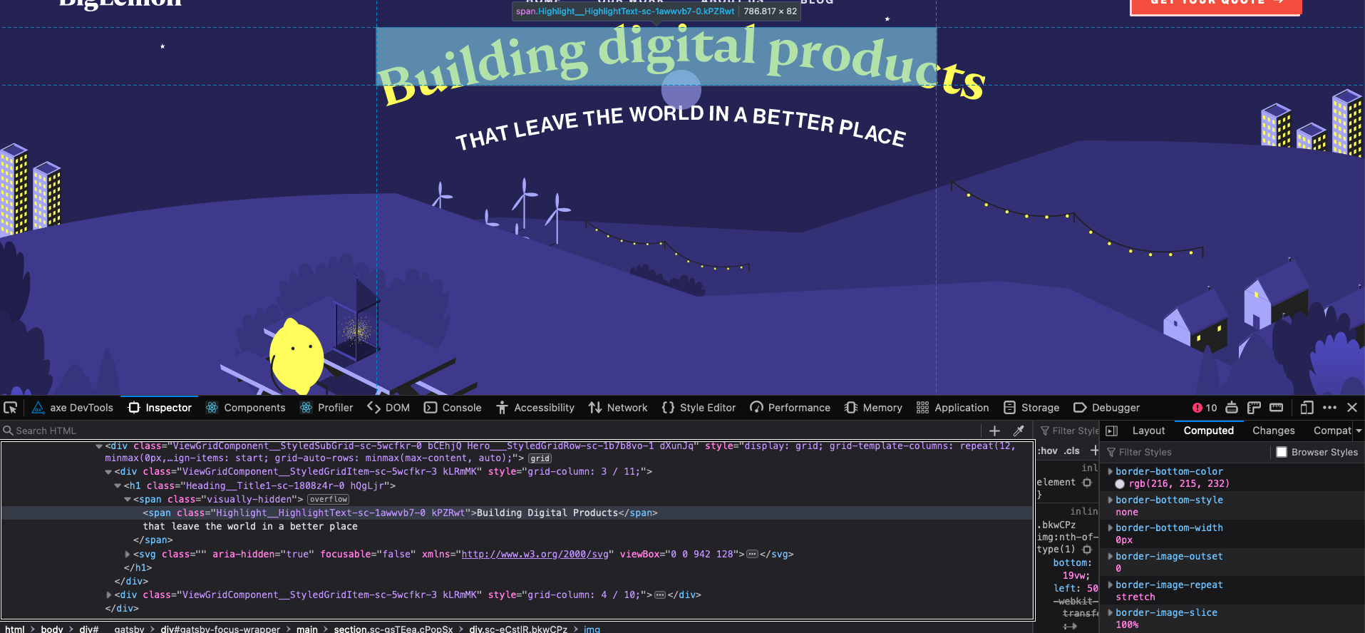
Focus Rings — Nice, high contrast focus rings in line with our branding
This is an example of where we’ve had to change the colours of our focus rings to help the user when navigating our site with the keyboard.
Because we have dark and light themes, we need both a dark and light variant of the focus rings. Focus rings are provided to assist keyboard users so they can see which element is in focus.

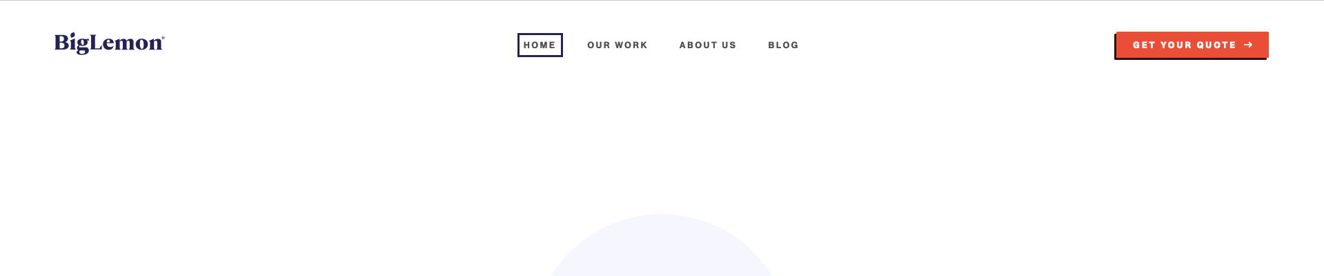
There's a photo of the top with the default styling, and one where the focus ring is yellow (against dark), one where the focus ring is dark purple (against light).
It is also worth pointing out we've ensured these focus rings only show if the user is tabbing (i.e., using the keyboard) to navigate the page so they don’t distract the sighted user when clicking on interactive elements.
Tricky Accessibility Challenge 1: Our Curved Heading
Curved text can be visually appealing, but can also be difficult to implement as a developer (that may be a reason you don’t see too much curved text on the web these days).
There’s no CSS styling ‘text-curve’ property, and existing solutions work best with monospaced fonts. But our main title is non-monospaced! What’s an accessible developer to do?
The implementation we settled on was to use an image. That sentence may trigger accessibility alarm bells: you’re not supposed to use images with text, because they are not reliably handled by assistive technologies.
But bear with me! To ensure a reliable experience for assistive technology users, we leveraged a tried and tested accessibility trick: offering one interface for the assistive technology user, and another for the non-assistive technology user, whilst keeping the core content consistent across the two interfaces.
For the tech savvy reader, here’s how we did it. Inside our main title element (h1) we have both (a) a text node (span) with the content, with a visually hidden class, and (b) the text image hidden from the assistive technology user (aria-hidden).
That way, the visual user sees the curved text image but not the text node (which is what we are seeing on the rotor), while the assistive technology user sees the text node but not the image. Best of both worlds!
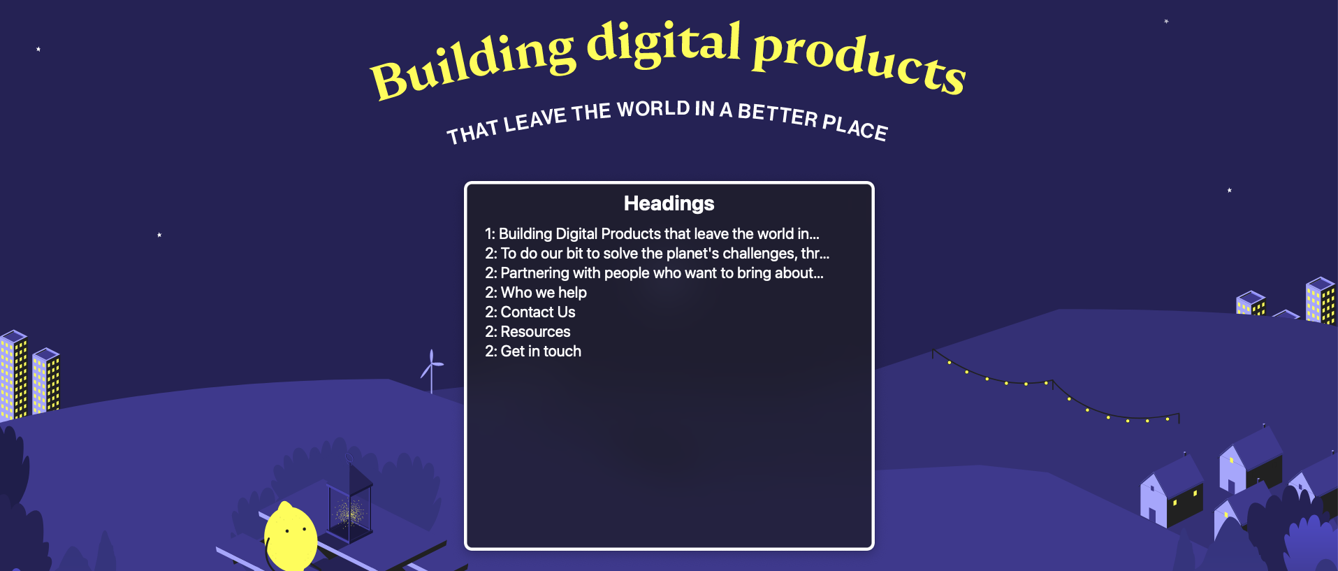
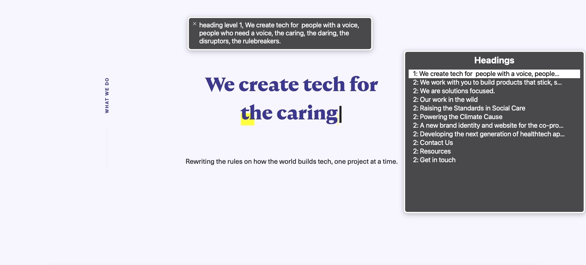
Tricky Accessibility Challenge 2: Typing Text
Another aspect of the site which required some thinking about was the ‘typing text’ animation on the ‘Our Work’ page. One strategy would be to make the region ‘aria-live’, that is, to act as a kind of notification updating the assistive technology user when content changes.
In my view, this is less than optimal. The visual user can readily stop focusing on the changing content, but as a screen reader user it is more difficult to ignore, say, spoken content as it’s coming in. A continuously changing title can lead to a confusing user experience for the assistive technology user.
Instead, I decided to display the full text for assistive technology users so they can enjoy the lovely copy too, without being bombarded with ever-changing content. There's an image displaying our page headings, and a bar at the top showing the full content.
What are your recommended resources you’d suggest to learn more about this?
When you’re starting out it can be quite tricky, as a lot of the documentation out there can be a little hard to get your head around.
If you’re considering developing a site with accessibility in mind, I would recommend watching the video series A11ycasts with Rob Dodson. Scott O'Hara also has great content on his blog.
It’s more of an art than a science, so get used to reading compliance documents and remember your users.
Want to learn about accessibility and your website? Tell us more about your project, get a quote today.


