
We’ve studied brewery websites and branding a lot lately in our effort to get more involved in this amazing industry, and these are some of the cracking brewery websites we’ve found so far.
As a brief disclaimer: it was actually a little difficult to find amazing brewery websites brimming with personality in the UK, particularly Wales. This is something we want to change. The British ones below are definitely setting craft beer marketing alight, and we’d recommend some of the new up-and-commers to take note.
We also created an awesome website for Beerd Bristol, so that's not included in this article. Disclaimer disclaimer: We're probably a bit biased to Wales, because we're Welsh ?
Long Live Brewery Websites
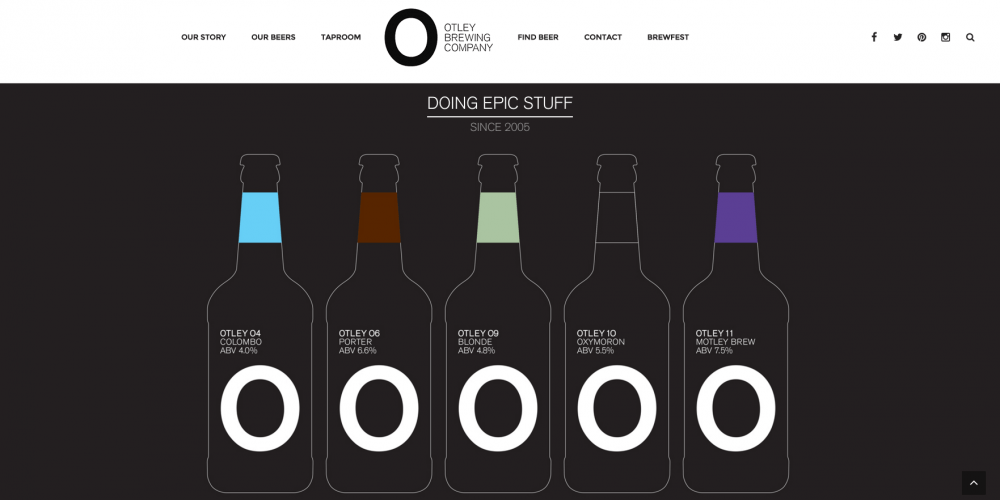
Otley

The Otley website oozes sophistication and class. Large photographs and inspiring statements on the homepage enforce the values of the brewery. Also, the clean branding works as a signature statement, contrasted well by vibrant pump clip colours and pictures. To me, Otley are one of the stand out breweries in South Wales. Being a designer, I think it’s largely down to their brand identity - they placed themselves in a unique position over a decade ago when there was a limited market. They innovated and tried something different - and it really worked! Fast forward to today and the brand identity still looks good and works great for them. Favourite Feature: Branding is spot on.
Tiny Rebel

All of this works to make the South Walian brewery instantly recognisable, reinforcing their quirky approachable identity. Designed in the same quirky manner as the brand identity the website is friendly, fun and engaging. Regularly updated custom graphics on the site make it really diverse. The loose styling really comes across as edgy yet friendly and the level of detailing on some illustrations is amazing. The beers page is really simplistic and easy to navigate and they’ve made buying your favourite beer a doddle. This, combined with the quirky brand identity translates into a really memorable website that shouts a lot about the brewery. Favourite Feature: The quirky branding and illustrations.
Loddon Brewery

Engaging, clean and interactive are words that spring to mind when browsing. As with many of the examples in this list, large imagery and appealing video really shines through. This allows the site to express its lively and vibrant brand identity. A real stand-out feature for me is the short videos on the beer page that show off the personality and passion behind the brewing process for each beer. The accompanied taste and colour infographics are really great addition too. Man, am I thirsty! Favourite Feature: Amazing Videos.
Truman’s Brewery

Using mixed media really lets the brand identity shine through. I particularly like the individual beer videos placed at the bottom of the homepage. If anything, these videos should really play a larger part on the site, they’re beautifully made and explain the brand story better in 20 seconds than any 1000 word about us page. It’s okay though, the eagle makes up for it. Favourite Feature: That logo, man. It’s an eagle!
Gower Brewery

The classic look of both the branding and pump clip artwork really stands out and makes the identity memorable. The website is informative and nicely presented with great calls to action allowing users to browse their online shop and buy their favourite brew. The beers page is really informative and allows users to explore all aspects of each beer, from colour, taste to complementary food matches. Favourite Feature: Classic-feel branding and food match feature.
Brewdog

The level of detailing on the bottle artwork alone is outstanding, not to mention their tone of voice, palette considerations and all out shelf presence. It really does reflect what Brewdog is about, but at the same time it hasn’t lost the original message. Nice one, punks! Brewdog care about their fans and this shines through on the site. By offering users a plethora of fandom to engage with, they really are connecting on a whole other level.
A sweet feature is Brewdog TV - people love to watch videos, so what better way to engage with your customers than show off your shenanigans through this medium? Though a very nicely presented site, it strangely doesn’t scream Brewdog as much as I thought it would with a more clean cut edge than we’re used to. That being said, there’s loads of awesome features throughout and the site is very nicely constructed with good copy, images, information, video, and downloads. The beer page really stands out for me. It’s simple, straight to the point, and really shows off some character from not only the Headliners and Amplified beer ranges, but all of the specialty brews, too. Favourite Feature: Brewdog TV and the beer pages.
Bonus
Crabbies

Clean tiles and bright colours not only make the site super engaging, but aide the user experience and make it easy to navigate. There’s a great use of different media types, including custom made and regularly updated competitions, games, and GIFs, filling those boozy ginger beer fans to the brim with engaging content. The power of social media integration on brewery websites today is more important than it’s ever been.
It not only directly connects the customers to the product, but also the company to their fans. People love sharing stuff they enjoy and Crabbies has really used this to their advantage. I don’t even like ginger beer and I want one! Favourite Feature: Brand communication is clear and engaging.
Any more?
What did we miss? Tell us onTwitter and we'll review them and add them to our next VIP list. We'd love for you to sign up to our monthly content roundup and get our articles straight to your inbox. You can do that on our Ticket to Awesome page.


